
What Uber Taught Me About Design
Uber simplicity isn’t magic — it’s architecture and design done right

On a recent trip to Barcelona, I used Uber for the very first time and I was blown away. What struck me wasn’t just that I got from point A to point B — it was how easy it was. I tapped a few buttons, my ride arrived in minutes, payment was invisible, and I didn’t have to think. It just worked.
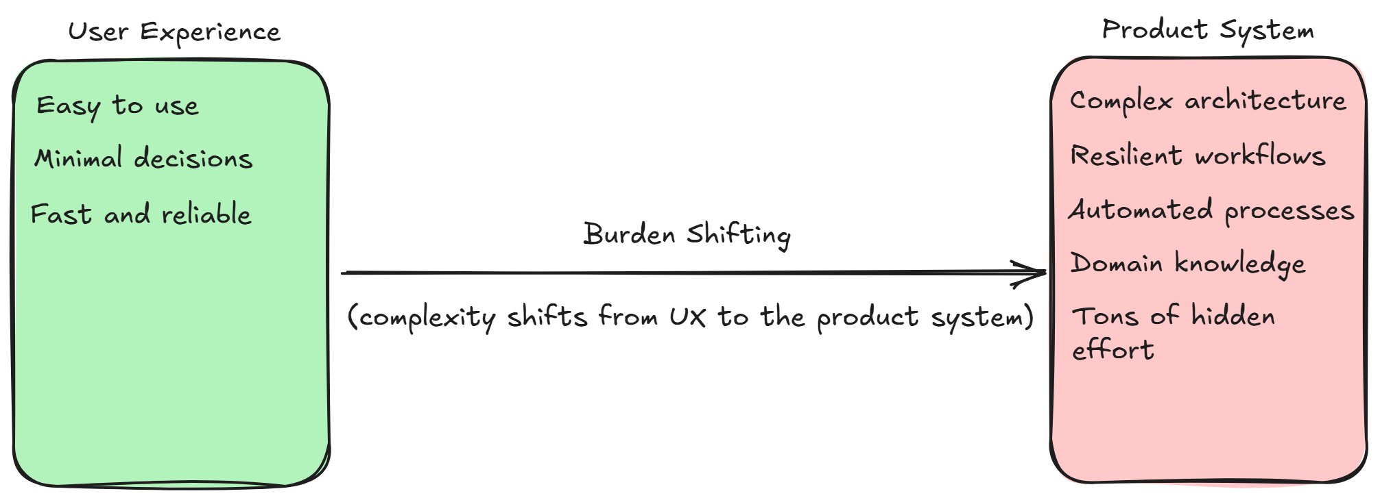
As a solution architect, this experience got me thinking. Simplicity for the user isn’t magic. It’s the result of conscious, often painstaking decisions made by designers, architects, and engineers. The complexity doesn't disappear — it shifts. I call this Burden Shifting Design: the practice of moving the hard parts away from the user experience and into the product’s architecture, processes, and operations.
The Wrong Approach: Offloading Complexity to the User
Too often, systems are designed for the convenience of the company or development team rather than the user. The result? Clunky interfaces, fragmented workflows, and experiences that force users to handle the complexity that should have been absorbed by the product:
“Please select from these 12 confusing options.”
“You need to navigate through multiple forms to complete this simple task.”
“Tell us which department to contact because we can’t figure it out for you.”
“Enter these details again because our systems don’t talk to each other.”
“We require you to upload the same document twice in different places.”
Technically, these products might work. But they fail the user because they place the burden in the wrong place. In time, products like these tend to lose the interest and loyalty of their users, or they get replaced by newer, smarter products that offer a better, simpler experience.
We’ve seen this happen again and again. BlackBerry and Nokia lost to the iPhone because Apple shifted the complexity inward, creating a seamless experience, while BlackBerry and Nokia clung to outdated, clunky interfaces.
Blockbuster was replaced by Netflix, which removed the friction of store visits, late fees, and availability issues, shifting the complexity to digital licensing, streaming infrastructure, and personalization.
Yahoo Search lost to Google, which delivered cleaner, faster, and more relevant results by shouldering the complexity of better algorithms and data handling behind the scenes.
The Right Approach: Burden Shifting Design
Now think about Uber. For me as a user, booking a ride was totally effortless. I just tapped a few buttons, and everything was taken care of. The app matched me with a driver in real time, calculated the price dynamically, processed my payment securely without me lifting a finger, and provided live tracking with accurate ETAs. It felt seamless — no friction, no confusion, no extra effort on my part.
And what impressed me even more was how smoothly things worked even when something didn’t go as planned. One time, I booked a ride, but the driver was taking too long to arrive. I decided to cancel — and even that was simple. With a single tap, I cancelled the ride, and the app handled the rest — no awkward calls, no hassle, no stress.
Behind the scenes, here’s what Uber was doing for me:
Matching me with a driver in real time
Calculating the price dynamically based on demand
Processing my payment securely
Tracking the driver live and giving me accurate ETAs
Handling cancellations, refunds, and adjustments smoothly
Ensuring compliance with local laws and regulations
Doing all this seamlessly while managing billions of transactions like mine every day
The user enjoys simplicity because Uber takes on the complexity. This is the essence of Burden Shifting Design — moving the hard work from the user’s side to the product’s side.
Next time we start designing a system, let’s think about Uber and companies like it. Let’s ask ourselves: How can we take on the hard work, so our users don’t have to? That’s where great products begin.